


Foodha
UI/UX Design, Service Design
Foodha is an app to facilitate hungry scad students to discover food opportunities together by sharing ideas and resources.
GOAL: TO CREATE AN APP THAT FULFILLS AN UNMET NEED OF SCAD STUDENTS.
We designed Foodha to help scad students find better alternatives for food while working at a SCAD building. We wanted to create an app that relies on visual language and recognizable metaphors.
USERS: SCAD STUDENTS WHO GET HUNGRY WHILE WORKING AT A SCAD BUILDING.
How can we help hungry students to find better food choices making them rely on each other rather than on outside parties?
We developed several concepts to tackle this problem.As we dove deeper into the specific concept, we defined and re-defined the app interactions and branding image.
We realized quickly from early experiences that we wanted to create a single user goal. This allowed us to pare down the original two user models (providers and hungry people) to a single user model that then selected what they could add to the food procuring process.
Information Architecture

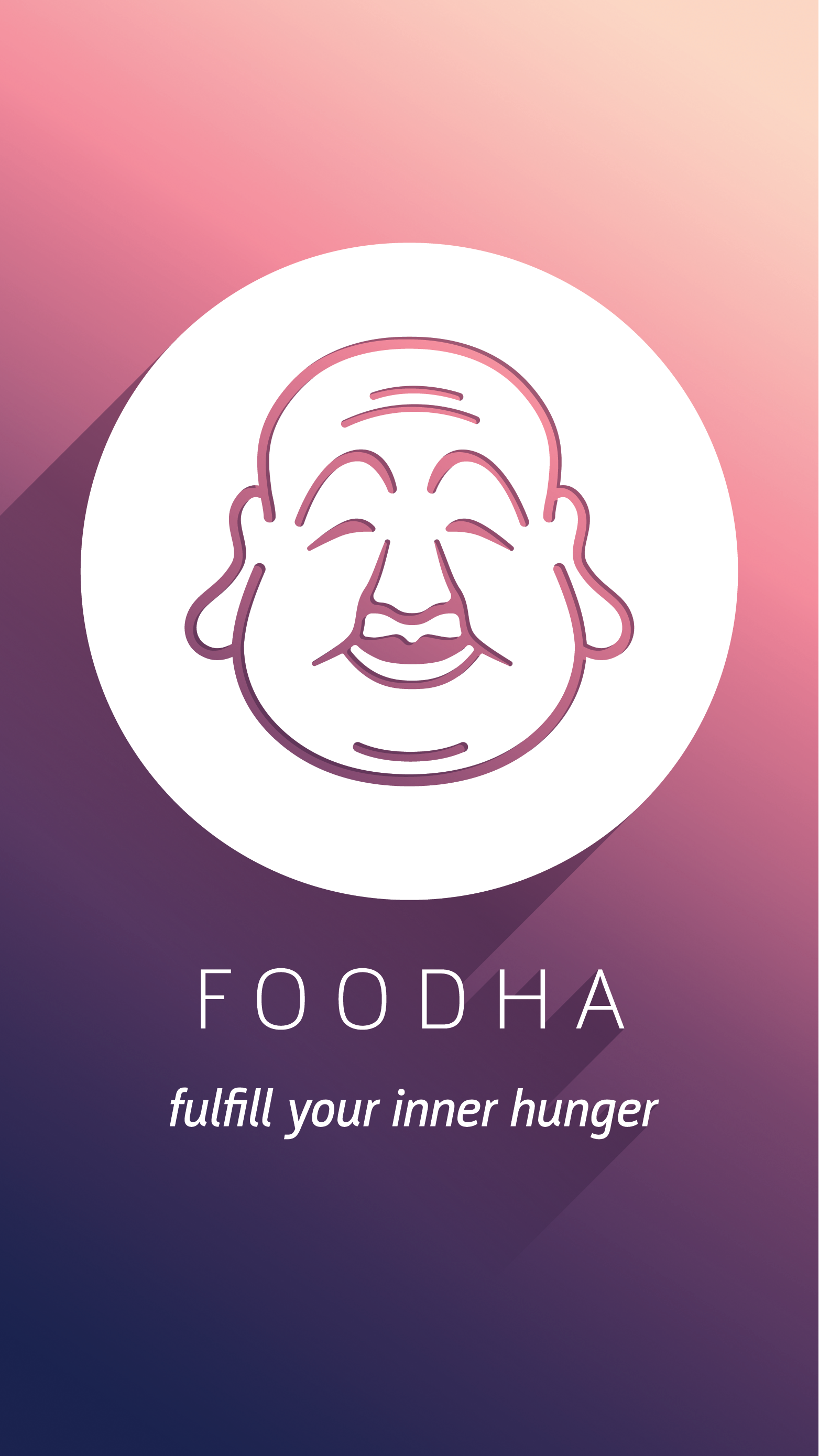
Finding the Buddha figure took forever, but after he was illustrated and we decided on the Zen Garden / Fast Food metaphor, the screens came together rather quickly. This visual style was based on the brightness of the neon signs of fast food takeout, paired with Zen Garden stylings and patterns to create a quirky and unique interface.

Initial Screens


Visual Rework
Although our class and my group deemed the interface successful, I personally found it busy and at times difficult to navigate. I reasoned that the target audience of the app, hungry students seeking late night respite, would feel better about an experience that is based on calmness and serenity. I stuck with the Buddha metaphor but instead looked to Japanese candles and soothing, cherry-blossoms-at-nighttime colors for inspiration.

The idea of a slow-burning candle and nighttime colors heavily influenced my visual theme.


I feel my visual update works more clearly with the ideas at hand, and I'm proud to have worked with this group.